Dashboard
What the Dashboard is for
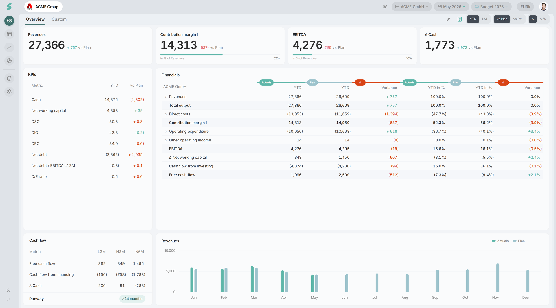
The Dashboard is the curated landing view for a company. It shows your most important KPIs, P&L and Cash Flow in a compact table, a revenue chart, and a liquidity panel - all on one page. It is built for fast orientation, ongoing monitoring, and sharing results with guests.
The Dashboard is fixed by design. To build your own layouts, see Custom Dashboards.
TL;DR
A curated snapshot of KPIs, variances, and liquidity, controlled by three global toggles in the subheader.
How the Dashboard works
All values respond to the three toggles in the subheader:
- Period - YTD or LM (last month)
- Comparison - vs. Plan or vs. Previous Year (PY)
- Variance format - Δ (absolute) or Δ% (percentage)
Period, plan, and last actuals are inherited from the global statycs context (selected once in the topbar), so the Dashboard stays consistent with Financials and Reports.
A skeleton loader is shown until data is ready. The KPI strip auto-collapses to a smaller height once you scroll past the top, so the page header stays close at hand.
Roles and edit mode
The pencil icon in the subheader opens edit mode:
- Super Admin / Admin - full edit (KPI cards, sidebar order, Financials ”% of”, Commentary publish)
- editor - can draft Commentary
- viewer / guest - read-only
Guests invited via Settings see only the published Dashboard - no Financials, Analysis, or Data access.
Dashboard elements
KPI strip (4 cards)
Four position-based cards across the top. Cards can be duplicated (same KPI in two slots) with independent ”% of” settings per card, so you can show e.g. EBITDA in absolute and as % of revenues side by side.
The picker groups KPIs by P&L, BS, CF, and KPIs. Cards with a target or sublabel render as a progress-bar variant. Click a card to focus its trend in the chart below.
KPI sidebar
A small table next to the Financials grid with the working-capital and balance-sheet ratios:
Cash & equivalents, DSO, DIO, DPO, Net debt, Net debt / EBITDA L12M, Debt / equity ratio
In edit mode, drag rows to reorder. On touch devices, use the up/down buttons.
Financials overview (P&L + Cash Flow)
A fixed table summarising P&L and Cash Flow rows, derived from the same data as Financials. Each row’s % of reference is set via the row menu - choose Revenues, Total output, Total assets, Equity, or No reference. Drill resolves recursively up to three levels into child positions.
Revenue development
Month-grouped paired bars: Actual vs the comparison series (Plan or PY). The corner action buttons let you swap in a different chart from the chart registry and toggle tooltips and data labels — these display toggles are session-only and reset on reload; statycs never stores them in your browser.
Cash development
Click any cashflow card to swap the chart for a 24-month line chart: solid Actual for the last 12 months, dashed forecast for the next 12, with a vertical dashed divider at the last-actuals month. Drag on the x-axis to zoom.
Runway
A coloured badge next to the cashflow cards showing how many months of cash you have left. It reads from the comparison toggle:
- vs. Plan — projects cash forward using the planned free cash flow from your selected plan, and counts the months until cash falls below zero.
- vs. PY (no plan reference) — divides the current cash balance by the average free cash flow of the last three months. If the L3M average is non-negative, runway is shown as
> 24 months.
The badge colour reflects severity (green = comfortable, amber = tightening, red = critical). Hover the i icon next to the label for the active definition.
Commentary
The subheader hosts the Commentary panel (rich-text, auto-saved per company × plan × last-actual-month) — the board-pack narrative for the period. See Commentary.
Related
- Custom Dashboards - build named multi-widget dashboards per company
- Financials - drill from any Dashboard row into accounts
- Analysis - define new KPIs surfaced in the picker