Custom Dashboards
What Custom Dashboards are for
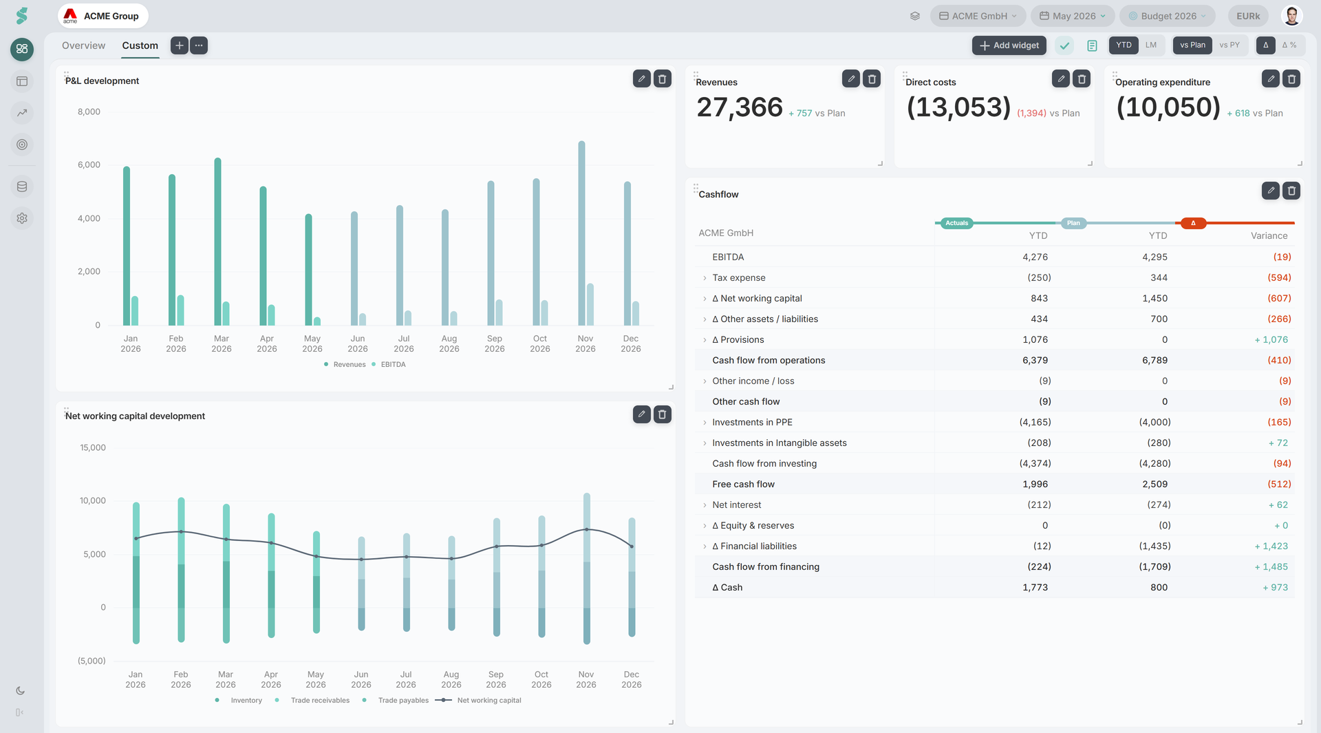
While the curated Dashboard gives a fixed, decision-ready view, Custom Dashboards let you build your own layouts per company — one for the board pack, one for ops, one for the cash war-room — and switch between them via the tab bar at the top of the Dashboard page.
TL;DR
Per-company tabs of named dashboards. Drag and resize widgets anywhere on a freeform 12-column grid, then save — admins only.
How Custom Dashboards work
Each company has its own set of dashboards, stored per company. A new company starts with the dashboards of the first sibling company on first load and then evolves independently.
Tabs sit in the same bar as the curated Overview (which always stays pinned as the first, fixed tab). Click + to add a new dashboard, click the pencil to edit, or click an existing tab to view it. Editing is gated to Super Admin / Admin; everyone else sees the saved layout read-only.
Edit mode
The layout is a freeform 12-column grid. Each widget has an explicit position and size (column, row, width, height) rather than flowing into fixed columns, so you can place things exactly where you want them.
In the editor:
- Name — the tab label.
- Add — opens the widget gallery; pick a widget kind to drop it onto the grid.
- Drag a widget to move it anywhere on the grid (width 1–12 columns).
- Resize from a widget’s edges/corner to set its width and height.
- Click a widget to select it and edit its properties in the side panel.
- Delete removes the selected widget; Delete dashboard removes the tab.
When you move or resize a widget over another, the overlapped widget is pushed down to make room, and the layout compacts vertically so widgets don’t drift far from the top. Placement is otherwise free — a widget can sit with empty space above it if you want a deliberate gap.
Save writes the dashboard back to the per-company store. Cancel discards the in-flight changes.
Widget kinds
There are four widget kinds. Each has its own properties panel, and the data widgets share period and comparison settings (range, M/Y, vs Plan / vs PY / both / none) where relevant.
Metric
A single KPI card — one headline number with its comparison delta, the same card style as the curated Dashboard’s KPI strip. Pick the KPI and its % of reference.
KPI
A compact list of several KPIs from the shared KPI catalogue (e.g. the working-capital and balance-sheet ratios). Pick any subset; defaults match the curated Dashboard’s sidebar.
Chart
Any chart from the Analysis chart registry, grouped by category (P&L, BS, CF, debt, etc.). Each chart respects its own period mode and comparison, and supports the same tooltip and data-label toggles as charts on the curated Dashboard.
Table
A statement table rendered inline: P&L, Balance Sheet, or Cash Flow. It shows the same rolling actuals-plus-plan figures as Financials, sized to fit the widget.
Persistence and sharing
Custom Dashboards are saved to your statycs account per company (not your browser). All users of the company see the same set of tabs; only admins can change them. Guests see the same read-only layout, the way they see the curated Dashboard.