Chart Builder
What the Chart Builder is for
The Chart Builder lets you assemble a chart from any combination of statement metrics and KPIs, preview it live, and save it into the Custom category in Explorer. It’s the escape hatch for anything the 30 ready-made charts don’t already cover.
TL;DR
Pick up to six metrics, choose a chart type, name the chart, hit Save — it lands in Explorer’s Custom category and can be swapped into any view slot.
How the Chart Builder works
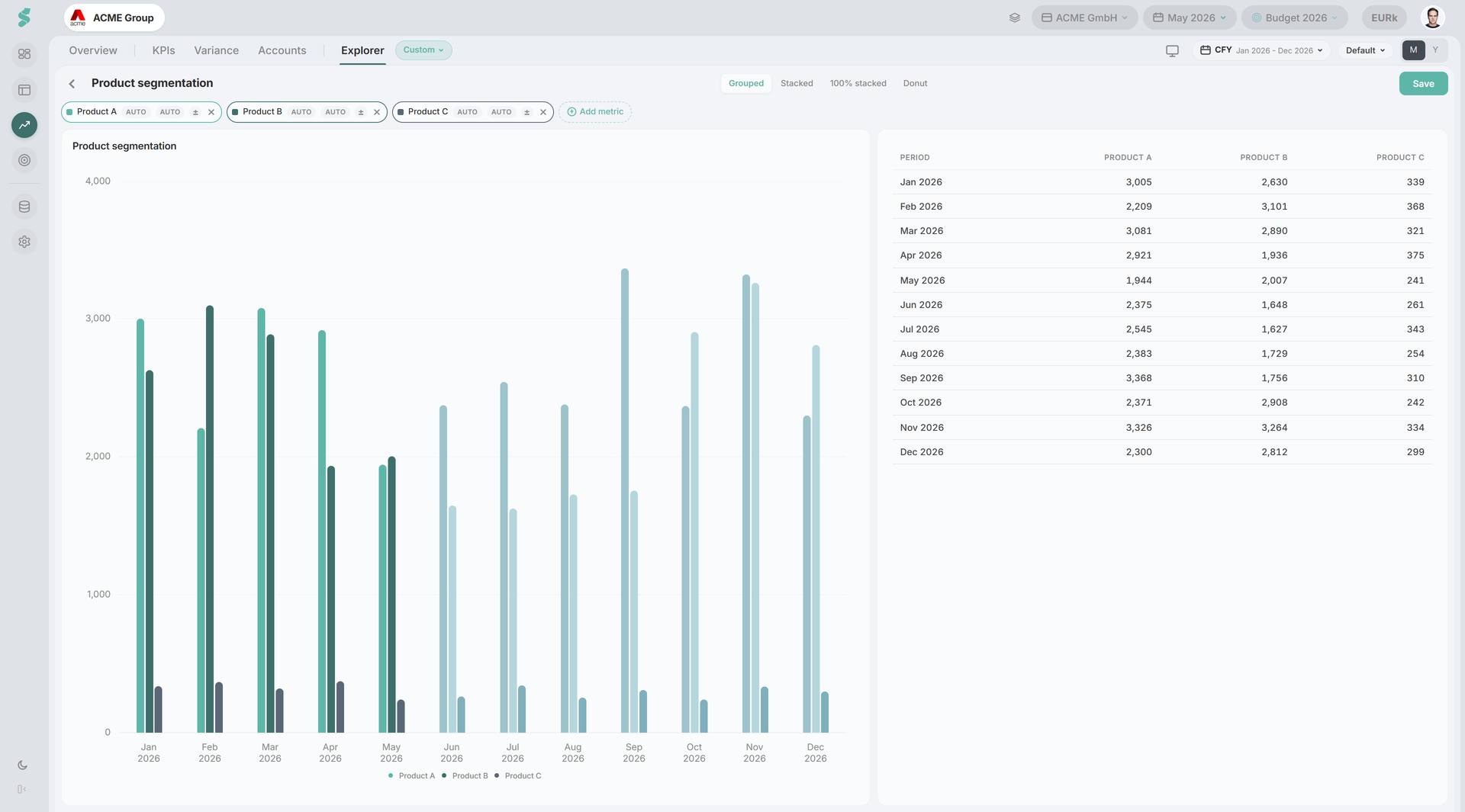
The builder opens as a full-page panel inside Analysis. Pick metrics with the + Add metric button, watch the chart preview and the data table below it update on every change, then save. Each saved chart is scoped per company. A new sibling company starts with the chart list of an existing one and then evolves independently.
Chart Builder elements
Toolbar
Title field, chart-type buttons, and Save. Chart types:
- Bar — grouped columns
- Stacked — stacked columns
- Line
- Area — stacked area
- Two axes — primary metric on the left axis, second metric on the right
The first metric you add auto-picks a sensible chart type (grouped bar for a small number of metrics, line as the count grows). You can override at any time.
Metric chips
Up to six metrics, each shown as a coloured chip with its own palette colour. The + Add metric button opens the Metric Picker — a categorised list of statement positions (P&L lines, BS lines, CF lines) and KPIs. Click an x on a chip to remove it.
Live preview
Below the chips, a 60/40 split: the chart preview on the left renders against monthly data, the data table on the right shows the underlying values per period. Both update as you add, remove, or change metrics.
Save
Save stores the chart definition (title, chart type, metric list, colour assignments) into the company’s Custom chart store. Once saved, the chart appears under Explorer → Custom, and can be swapped into any Overview or custom view slot from the chart picker. Re-opening Save with the same chart updates it in place.