Presentation Mode
What Presentation Mode is for
Presentation Mode turns any selection of analysis charts into a full-screen slideshow — one chart per slide, larger fonts, no chrome. It’s built for board meetings and management reviews where you want to walk a room through the numbers without sharing the editor UI.
TL;DR
Pick the charts you want, hit Start, then drive the slideshow with the arrow keys. Esc to exit.
How Presentation Mode works
Launch it from the floating present button on any chart view or the Explorer tab. The overlay opens in two phases: a chart picker, then the slideshow. Charts are pulled from the same Analysis registry and respect the active range and period from the tab you launched from.
Presentation Mode elements
Phase 1: chart picker
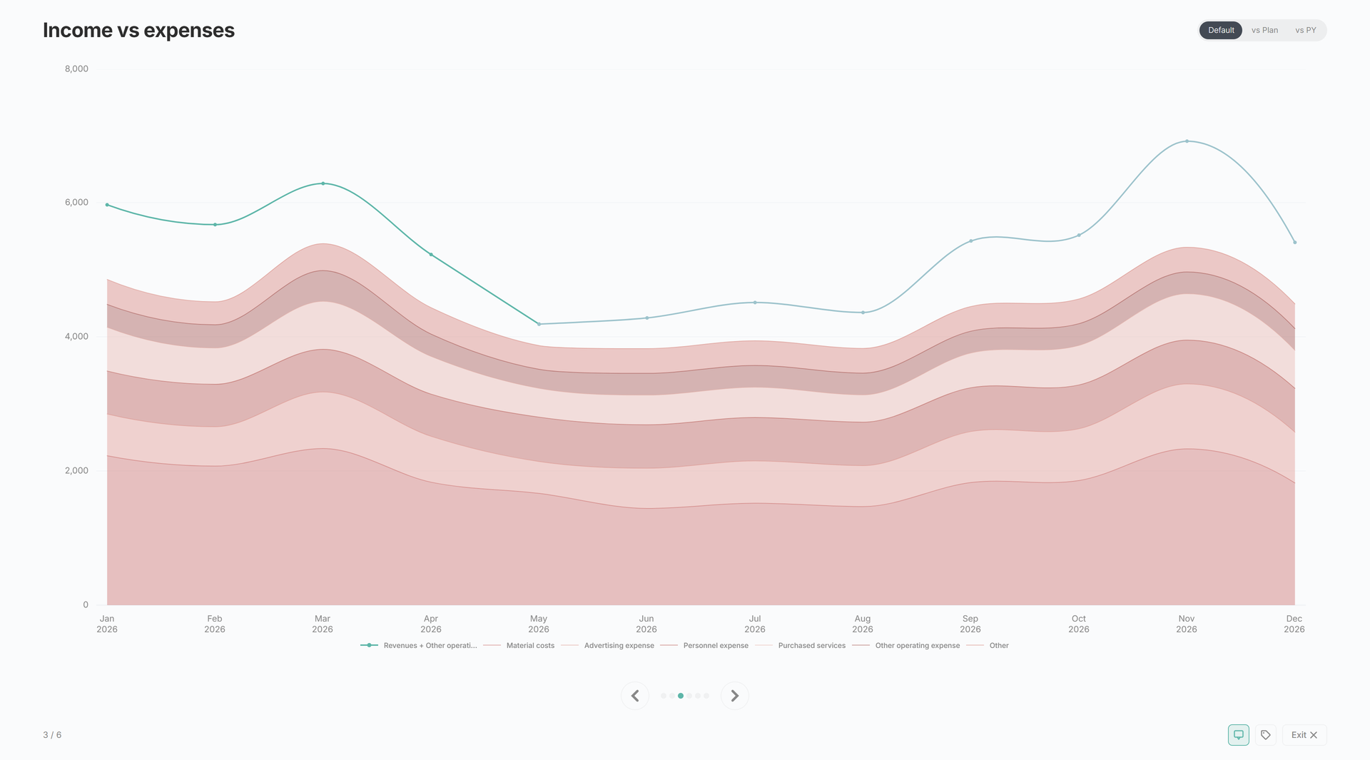
A categorised checklist of every chart in the registry (P&L, Revenues, CF & Debt, NWC, BS, Custom). Six charts are pre-selected as a sensible default — P&L development, Revenues, EBITDA, Margin development, Income vs expenses, and EBITDA bridge. Tick or untick anything else, then Start to load the data and switch to the slideshow.
Phase 2: slideshow
Each slide shows one chart at presentation size with its title and any variance callout above it. Charts use the same chart-action buttons as elsewhere in Analysis, so tooltip and data-label preferences carry through.
Navigation
- → or Space — next slide
- ← — previous slide
- Esc — exit
- Progress dots — click any dot to jump to that slide
- Prev / Next buttons and an Exit button are available on screen for non-keyboard use
- A counter (
3 / 6) sits in the footer
The slideshow wraps around — past the last slide, you’re back at the first.
Related
- Analysis — where the present button lives
- Chart Builder — Custom-category charts also appear in the picker