Analysis
What Analysis is for
The Analysis workspace is where you go to understand why the numbers move. It groups around 30 ready-made charts, a KPI catalogue, a variance bridge, and an account-level explorer behind a single tab bar, all reading from the same confirmed actuals and selected plan as the rest of statycs.
Analysis is read-only as a view. KPIs created here surface in the Dashboard picker.
TL;DR
A tabbed workspace: curated chart views (Overview + admin-named custom views), an Explorer for the full chart catalogue, plus KPIs, Variance, and Accounts.
How Analysis works
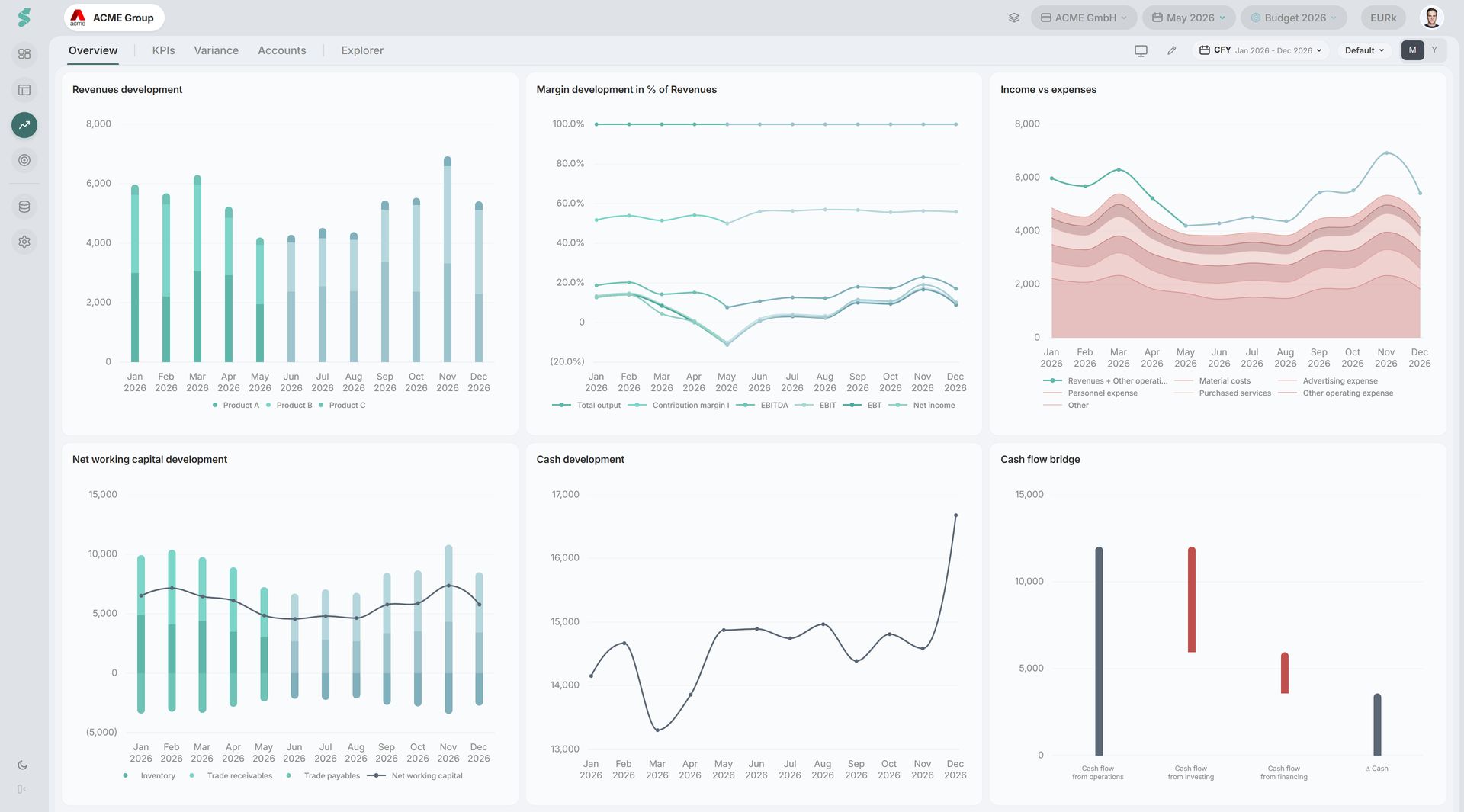
The tab bar drives everything. Overview and any admin-created views (e.g. “Board Meeting”, “Revenue Focus”) render a 3x2 grid of swappable charts. Explorer is the full catalogue, organised by category. KPIs, Variance, and Accounts are dedicated tools.
A single set of subheader controls applies to the active tab: range preset, period mode, and tab-specific extras (Variance KPI, Accounts compare, etc.). The catalogue covers P&L, Revenues, CF & Debt, NWC, BS, plus a Custom category for charts built in the Chart Builder.
Analysis elements
Tab bar
- Overview — the default chart grid for the company.
- Custom views — admins can add any number of named tabs; each gets its own 3x2 grid. Views and grids are scoped per company; a new sibling company starts with the existing sibling’s layout and then evolves independently.
- KPIs, Variance, Accounts — fixed tools.
- Explorer — separator pill with a category dropdown (P&L / Revenues / CF & Debt / NWC / BS / Custom).
Range preset
A calendar pill with: CFY, YTD, L3M, L6M, L12M, Prior Year, N12M, All, and a Custom range picker (month grid, click start then end). Hidden on the KPIs and Accounts tabs.
Period mode (M / Y / P)
- M monthly, Y yearly on chart views, Explorer, and Variance.
- P is the yearly P-mode used on the KPIs tab; switching to KPIs forces P and restores your previous mode on leaving.
- Variance and Accounts hide the M/Y toggle entirely.
There is no quarterly view.
Edit mode
The pencil button toggles two independent edit modes: one for chart views (swap chart slots, manage view tabs as admin) and one for the KPIs tab (add, rename, edit formulas). Editors+ only.
Per-chart actions
Every chart card carries the same action buttons: toggle tooltip and toggle data labels. (Swapping which chart fills a grid slot is done in edit mode, above.) These display toggles are session-only — they reset on reload; statycs never stores them in your browser.
Variance and Accounts subheader
When Variance is active, the subheader gains a target-KPI pill (EBITDA / EBIT / Net income / Contribution margin I / Total output), a materiality input, and L1/L2 + vs Plan / vs PY toggles. Accounts shows its own period preset and a vs Plan / vs PY pill.
Presentation mode
A floating present button appears on chart views and Explorer; it opens Presentation Mode for a full-screen slideshow.
Related
- Chart Builder — build custom charts saved into the Explorer Custom category
- Variance — waterfall bridge from Plan or PY to a target KPI
- Presentation Mode — full-screen slideshow of selected charts
- Dashboard — surfaces KPIs defined here
- Financials — same data, statement view